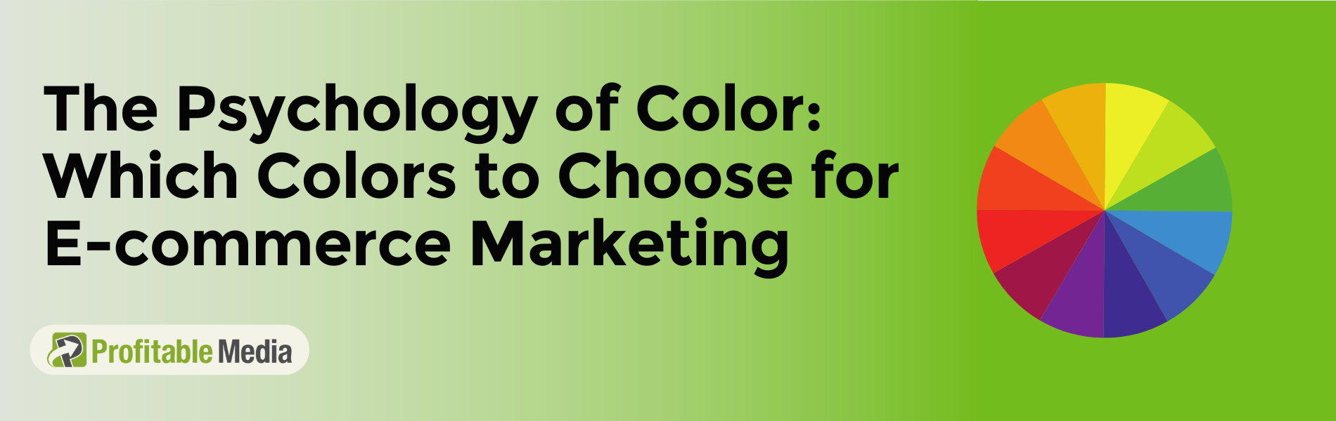
If there’s one thing you’d remember from walking down the cereal aisle, it’s the colorful packaging popping from every shelf, each one vying for your attention. The vibrant blues, fiery reds, calming greens – they’re all deliberately chosen. It’s not just happenstance. Indeed, the psychology of colors is a strong tool in marketing, particularly in e-commerce.
In fact, according to a study, color psychology can influence 85% of customers’ purchasing decisions. Fascinating, isn’t it? As humans, we are naturally visual beings, and it’s no surprise that the choice of colors can greatly affect our purchasing decisions, often at a subconscious level.
However, leveraging the power of colors in e-commerce isn’t as simple as splashing a rainbow across your website. It’s a strategic process that can mean the difference between converting a virtual window shopper into a committed buyer.
Understanding the psychology of color in e-commerce and marketing is pivotal. Also, the choice of colors for your e-commerce business goes beyond personal preferences or current design trends. It’s about understanding how colors can impact your potential customers’ emotions and behavior. If you find yourself stuck deciding on the color palette for your e-commerce brand or marketing campaigns, this blog post is for you.
We’ll help you understand how the strategic use of the right hues can transform your website visitors into customers. So, let’s explore the color psychology in e-commerce and marketing and help you pick the best color for marketing campaigns:
What is the psychology of color?
Color psychology, essentially, is the science that studies how color influences our actions and decisions. Yes, you read that right. Colors do affect our choices – from the clothes, we wear to the food we eat, even to the apps we frequently use.
That shirt in your favorite shade you couldn’t resist buying? The tasty-looking packaging that made you choose one brand over another? The attractive app icon that you’re more likely to tap? They all boil down to strategic color usage.
However, interpreting the psychology of color isn’t as simple as saying “red means stop, green means go.” It’s more complex and nuanced. The impact of colors goes far beyond their symbolic meanings. Your reaction to color is shaped by a multitude of factors – your childhood experiences, cultural background, personal preferences, values, and even your gender.
For instance, while red might signify love and passion in one culture, it might denote danger or warning in another. So, when it comes to color choices in e-commerce, you need to think beyond picking a color that looks good. It’s about understanding how that color might subconsciously impact your customers’ buying behavior.
A smart business understands and harnesses the psychological implications of colors to create a successful brand. So, are you ready to understand the compelling role of color in e-commerce, and how the strategic use of color can indeed make people click “Buy Now”?
Does Psychology of Color Really Matter in Marketing?
Let’s take a look at some key stats to better answer this question:
- Color is pivotal in product acceptance, with research from Skilled showing that 60% of individuals let color determine whether they accept or reject a product.
- A significant 84.7% of consumers pinpoint color as the main motivator behind their product purchases.
- Initial impressions about a product or environment are formed rapidly, usually within 90 seconds, with colors accounting for 62% to 90% of this judgment.
- Research shows that color advertisements outperform their black-and-white counterparts, attracting nearly 50% more views.
Colors are more than just visual delight, they’re emotional triggers, influencing moods and sparking reactions. When it comes to crafting your marketing strategy, color choice isn’t merely about aesthetics; it’s akin to selecting your brand’s wardrobe – setting you apart or losing you in the crowd.
Strategic color utilization in marketing can gently guide your audience’s gaze to the messages you wish to highlight. Here lies the immense value of color psychology – it’s like a secret key to projecting your brand persona precisely as you envision it.
For example, the color green often symbolizes nature, vitality, and serenity. If your brand is about the wellness industry, using green in your color strategy can fortify your brand’s image, making it irresistibly appealing to your target market.
However, choosing an inappropriate color can cast an unfavorable light on your brand. Imagine an emergency services website using a lot of yellows and pinks in its web design. It is unlikely to resonate well with the seriousness and urgency associated with the services, confusing the audience.
As a marketer, you can utilize color psychology to shape public perception of your brand and steer their interactions. The colors you employ can spotlight pivotal aspects, subtly influencing your audience’s decision-making.
Therefore, comprehending the symbolism of different colors isn’t just a “nice-to-have” for a content marketer. It’s an absolute must. To put it simply, color psychology is far from being a marketing buzzword – it’s a fundamental instrument that can substantially amplify your brand’s triumphs.
Now let’s analyze major colors to find out what meanings they convey and what color combination can fit your ecommerce brand.
The Effect Of Different Colors On Buyers’ Emotions
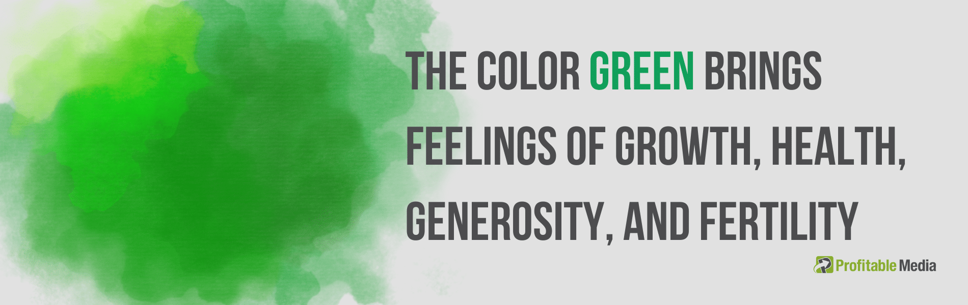
When it comes to the psychology of color, the color green has deep ties to nature and wealth. It symbolizes growth, health, generosity, and fertility. But it can also be linked to feelings of envy.
If your business is in the wellness or fitness space, using more green in your online store could be beneficial. For instance, you could incorporate a green background into your logo or homepage banner.
Think of Shopify for instance. They used green color in the logo design to symbolize growth and prosperity. It’s not by chance that this color matches their mission perfectly. Shopify is all about helping businesses flourish in the online marketplace.
Also, think about Starbucks for a moment. Their logo and stores are bathed in a soothing shade of green. This color choice isn’t random – it symbolizes growth, freshness, and prosperity, which align perfectly with the brand’s identity. Moreover, this particular shade encourages a sense of relaxation, making customers feel at ease when they step into their stores.
Another great example is Evernote. They utilize a vibrant green throughout their website and in their logo. This color, often associated with freshness and innovation, mirrors the brand’s focus on keeping ideas fresh and workflows efficient. Plus, the green lettering against the white background on their site makes their “sign up for free” call to action pop, drawing in potential users.
Clearly, green has its advantages in design. Yet, you should remember a few things while working with this color.
For instance, text in various shades of green on a green or patterned background can strain your readers’ eyes. To avoid this, aim to add more contrast. This way, you make the content more reader-friendly and ensure your message gets across without any hiccups.
Related: Color Psychology: Using Green In Marketing + Design Tips
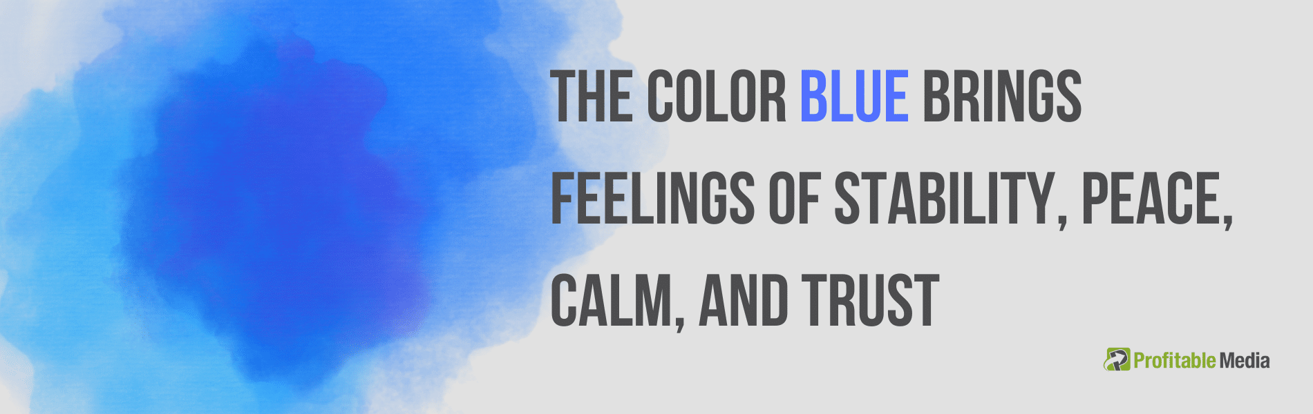
The color blue is strongly linked to the serenity of the sea and the vastness of the sky. It’s associated with feelings of stability, peace, calm, and trust. So, when you weave the color blue into your branding, your customers may well perceive your brand as dependable and soothing. However, do remember that blue can also evoke negative feelings, like sadness or a sense of coldness.
Take the color blue on your website as an example. You could incorporate it into your logo or your top navigation bar. Some online retailers even use blue for trust certifications, guarantees, or ‘free shipping’ icons to emphasize the feeling of trust that blue brings.
Think about well-known tech companies like Facebook, Twitter, and LinkedIn; they all use blue widely in their marketing. But it’s not just tech companies that opt for blue. Take Walmart, a retailer, for example. The blue color in the logo design aims to position the brand as reliable and stress-free, emphasizing that Walmart is a one-stop shop for your needs, from groceries to clothing.
Intel is a notable tech brand that uses blue in its branding. The blue in Intel’s logo serves to reflect the brand’s reliability and competence in the realm of technology, creating an image of a trustworthy brand that provides high-quality and safe products.
So, no matter your industry, the strategic use of blue can help bolster your brand’s image of reliability and trustworthiness among customers.
Related: Surprising Research on the Color Blue
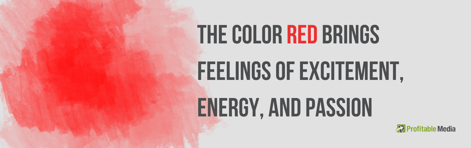
Red is a color that captures attention and sparks feelings of excitement, energy, and passion. It can also suggest urgency or caution. You might have seen some businesses using red for “buy now” buttons or packaging to stand out. Talking about the psychology of color, red is the most intense color and can spark strong emotions.
However, because red can also signify danger, it’s best to use it carefully. If you’re thinking to use red on your website, you might want to use it for call-to-action buttons or sale icons, especially if it contrasts well with your overall design.
Mentioning some examples: the color red is a key part of branding for companies like Coca-Cola and YouTube. Coca-Cola often uses red in its branding, likely because the color stimulates appetite. The company also uses words like “happiness” in its branding, so the red color helps to build excitement.
YouTube probably uses red because of the excitement that comes with watching online videos. Notice how the red part of their logo design is the play button, which can encourage viewers to click and start watching.
Related: The Psychology of Design: The Color Red in Marketing & Branding
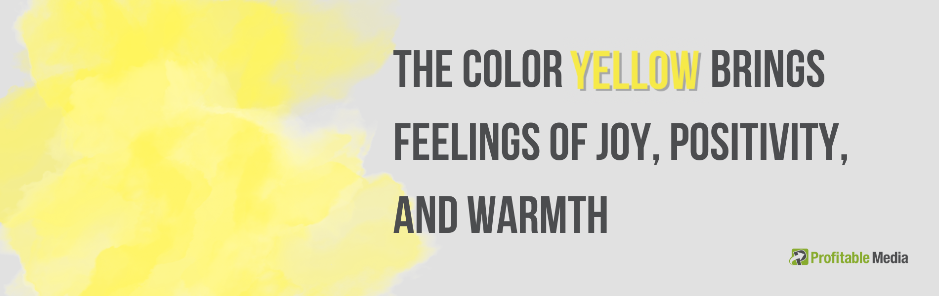
Yellow brings up feelings of joy, positivity, hope, and the warmth of summer. On the other hand, yellow can also suggest dishonesty and caution. Some businesses like to use a bright yellow as a background or border for their website layout.
If it fits your website’s design, you might even use yellow for the ‘free shipping’ banner at the top of your page. Adding a little bit of yellow can help your website visitors associate your online store with something positive.
Looking at renowned brands, McDonald’s and Snapchat are great examples that use yellow in their branding. Many people instantly recognize McDonald’s golden arches. This fast-food chain uses yellow to stimulate feelings of happiness and comfort, appealing to customers looking for a quick, satisfying meal.
Snapchat, a popular social media platform, also uses yellow in its logo. This vibrant color helps the brand to stand out in the competitive digital space. The fun and fresh feeling associated with yellow aligns perfectly with the platform’s youthful user base and their optimistic view on sharing moments of their life.
Related: The meaning of yellow: what a yellow logo says about your brand
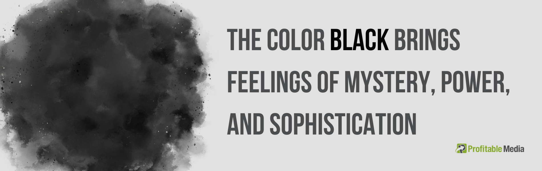
Black is a color that commands attention in the retail space. It’s often associated with an air of mystery, power, and sophistication, yet it can also evoke feelings of sadness or anger. It’s not uncommon to see fashion brands incorporating black into their logos, as it lends an air of elegance.
As the black text is easily readable, many brands prefer to use it on their websites. Some even opt for black-and-white lifestyle images or icons to ensure a consistent, elegant aesthetic across their digital platforms.
Gucci and Adidas are two notable brands that use black color in their branding and marketing. Gucci, a high-end fashion house, integrates black into its logo and utilizes monochrome images on its website for a uniform and classy look.
As you navigate through their site, you’ll notice a thick black top navigation background. They use black fonts for image captions and text, and even their call-to-action buttons are black, a striking contrast against a white backdrop, typical of many fashion retailers.
Similarly, Adidas, a leading sports brand, adheres to black, white, and grey colors in web design. The brand logo and fonts are predominantly black, which makes the website easily legible.
Like Gucci, their call-to-action buttons are black, visually guiding customers to add items to their ‘bag’ (cart). The use of black by these brands signifies not only their power and elegance but also enhances the user experience on their websites.
Related: What is the meaning of black?
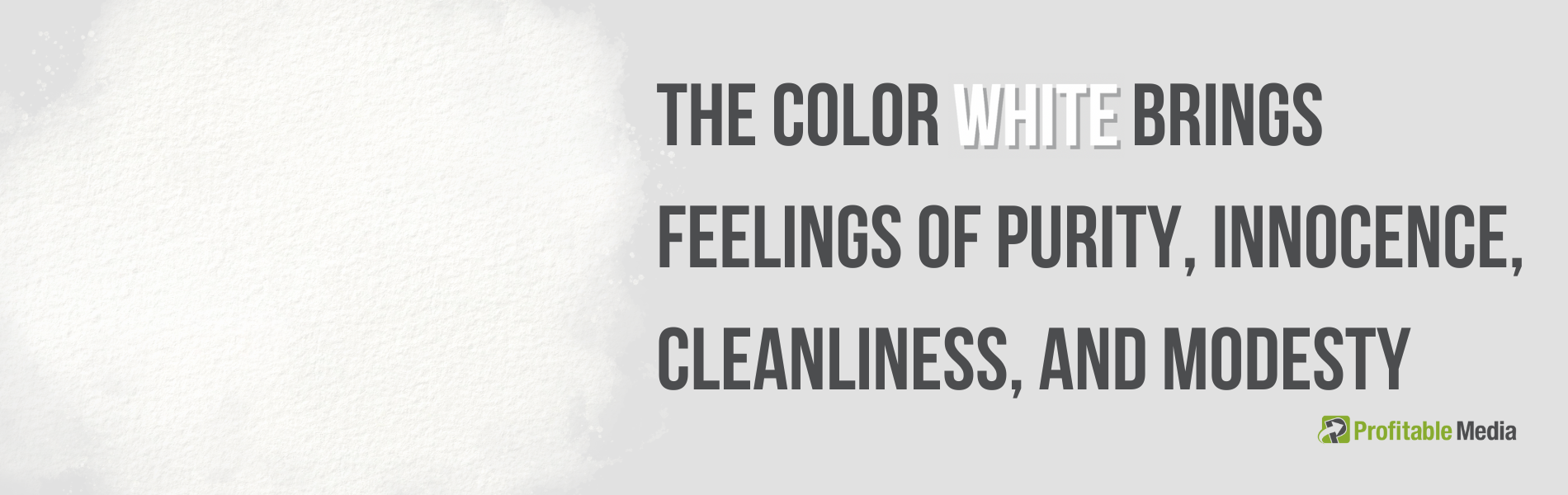
White, in the realm of color psychology, often signifies purity, innocence, cleanliness, and modesty. However, remember that this is predominantly the case in North American cultures. In other regions, white might symbolize entirely different concepts, so it’s important to consider your target audience’s cultural background.
While white usually carries positive connotations, it can also evoke a sense of coldness and sterility. In the realm of online retail, white is a frequently used color, often serving as the backdrop for product design or the main color scheme for web pages. This is largely due to the high readability of black text on a white background.
Let’s look at brands such as Zara and Apple, which prominently use white in their marketing strategies. Zara’s website design largely features white – the header, logo, and background predominantly use this color.
Depending on the background color (grey or black), they switch the font color to white, and when the background is white, they opt for black text. This ensures excellent contrast and enhances readability.
Apple’s online storefront presents a sleek contrast with its black top navigation and white logo. With a predominantly white background, they opt for grey as the backdrop for product images, introducing another tone to the palette. Like many brands that adopt white as a central color, Apple effectively pairs it with black or grey, creating a striking, minimalistic aesthetic.

Purple, throughout history, has been a color associated with majesty and grandeur. Back in the days of the Roman Empire, esteemed dignitaries donned Tyrian purple, a color considered more valuable than gold.
Even Queen Elizabeth I went as far as prohibiting anyone outside the royal lineage from wearing purple. These ancient ties bestow purple with an air of wisdom, affluence, and sophistication. Businesses often employ this color to signal superior services, products, or experiences they provide.
However, purple can also imply excess, moodiness, and indulgence, necessitating a delicate balance in its usage.
FedEx, the globally recognized courier delivery services company, utilizes purple in its logo and branding. The vivid purple lends a sense of sophistication and distinctiveness to the brand, tying in with its commitment to providing superior service.
Twitch, the popular live-streaming platform, employs purple extensively in its logo and user interface. The shade of purple used by Twitch not only captures the attention of its predominantly young, tech-savvy audience but also helps the brand stand out in the crowded online space. The color aligns with Twitch’s mission to provide a unique, engaging, and superior experience for its users.
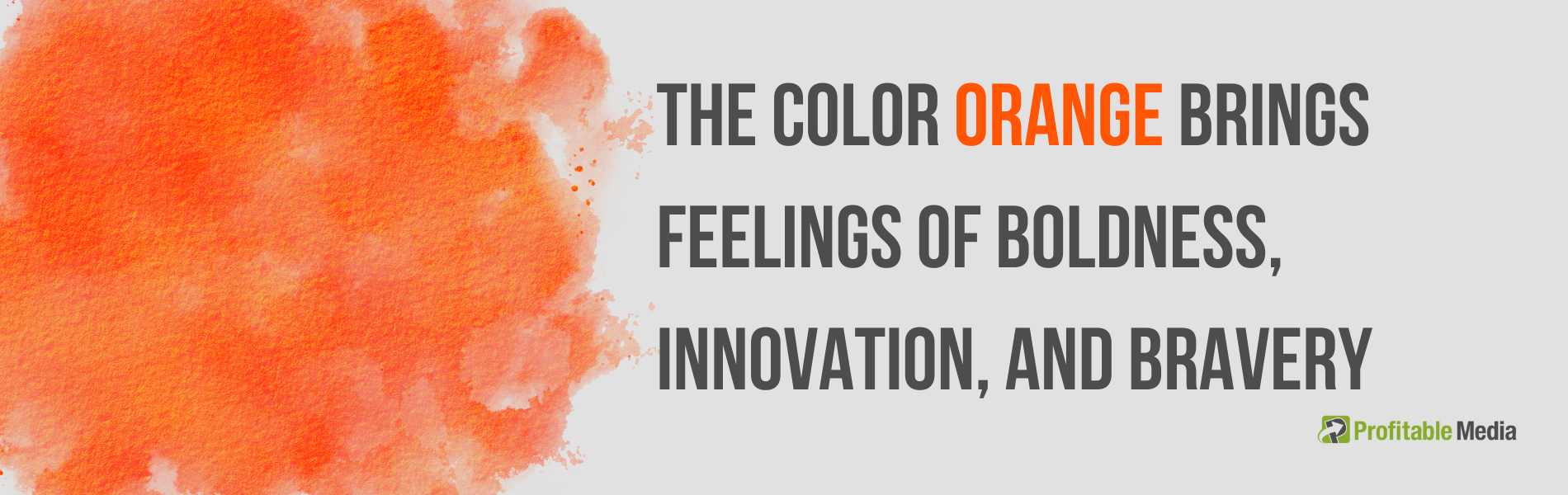
orange speaks volumes about boldness, innovation, and bravery. This lively hue, associated with the warmth and energy of the sun, resonates particularly well with brands that embrace a non-traditional or more casual identity.
However, not all interpretations of orange are quite as radiant. It can also evoke sensations of frustration, deficiency, and sluggishness, or even give off a vibe of immaturity or naivety. Consider, for example, the distinction between Hermès, a luxury brand, and Cheetos, a snack food company.
To get some inspiration, take a look at brands like Home Depot and Fanta that boldly employ orange in their branding strategies. The Home Depot, a well-known home improvement retailer, uses orange as the main color in its logo, mirroring its energy, creativity, and commitment to home improvement solutions. The use of orange also matches the practical, hands-on nature of their business.
Fanta uses vibrant orange to symbolize its bubbly, fun, and youthful persona. The color aligns perfectly with the brand’s energetic and playful marketing approach, which is designed to attract a younger audience. Through this vivid orange, Fanta successfully embodies the excitement and whimsy that sets it apart in the competitive beverage market.
Related: The Psychology of Orange in Marketing
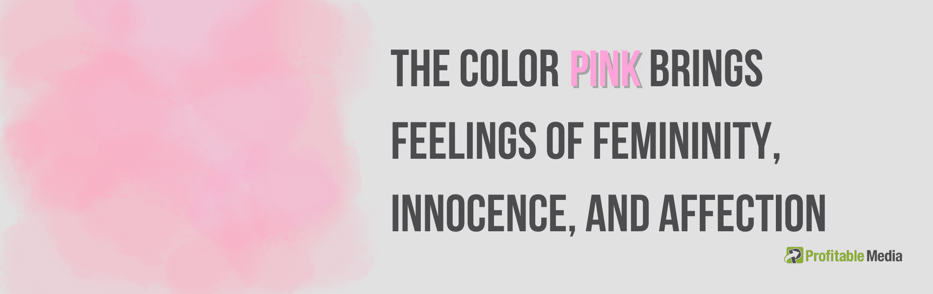
The hue known as pink is often favored by enterprises whose primary target market is women. The psychological implications of pink encompass elements such as femininity, lightheartedness, innocence, and affection. Some companies opt for pink color in their product design, particularly for playthings intended for young girls. Others utilize this shade prominently in their logo, web layout, or as a means to emphasize essential messages.
Given that pink symbolizes femininity, it’s not surprising that brands such as Victoria’s Secret and Barbie utilize this color extensively. Victoria’s Secret even has a sub-brand named “Pink”. Their website skillfully combines hues of pink and black to spotlight important marketing elements.
Their logo and certain marketing messages also prominently feature the color pink. On Barbie’s website, the call-to-action buttons are displayed in a vibrant pink color. The primary navigation bar and the dropdown menus subtly incorporate color. Undoubtedly, their product packaging and logo emphasize the feminine connotations of pink in their branding.
Please note that using pink isn’t a steadfast rule for attracting a female audience. The color should be used thoughtfully, mirroring the overall personality and message of the brand. It’s the strategic use of pink and the emotional connections it fosters that truly make these brands appealing to their target demographic.
Related: Pink Branding: How & When To Use Pink In Your Designs
The Best Way To Use Color Psychology In E-commerce
So now that you understand the basic psychology of colors, it’s time we figure out how you can use it to build a profitable and meaningful online presence. Here are some valuable tips to start with:
Conduct demographic audience analysis
Color preferences can greatly differ depending on one’s gender and age, making it crucial for sellers to consider these factors when marketing their products. For instance, if your merchandise is primarily aimed at males, it’s beneficial to employ colors that generally resonate with this demographic.
According to a study, males predominantly favor the color blue, with green and black trailing behind as their second and third choices, respectively. On the other hand, for females, while blue remains the top choice, purple closely follows as a second preference, and green holds the third spot.
The study further revealed that, regardless of gender, blue emerged as the top choice for 42% of respondents, underscoring its universal appeal. Purple and green tied for the second spot, each claiming 14% of the preference share, while red came in third with 8%.
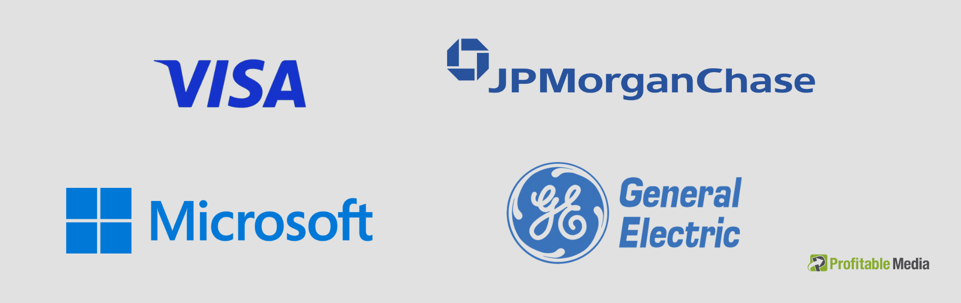
These findings shed light on the prevalent use of blue by many businesses, particularly in their web design. Recognized companies such as JPMorgan Chase, VISA, Microsoft, and General Electric use blue predominantly, realizing its positive impact on consumer perception.
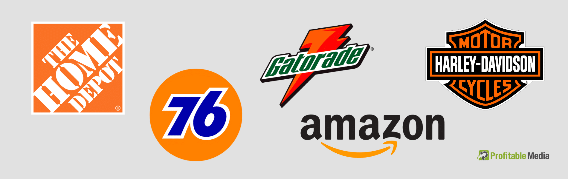
Orange is often perceived as a cheap color that symbolizes cost-effectiveness. Nevertheless, this viewpoint does not deter brands from integrating it into their core visual identity. Brands such as Amazon, Harley Davidson, The Home Depot, 76, and Gatorade all embrace orange as a significant part of their brand’s aesthetic.
Your brand can indeed flourish, even if it doesn’t strictly adhere to conventional color preferences. However, it’s crucial to bear in mind your primary demographic when deciding on the color scheme for your brand.
The colors you choose should align with the values and expectations of the consumers you aim to engage. This will ensure that your branding not only resonates with your audience but also reinforces the image and identity that you wish to portray.
To learn more about colors and gender, read the following blog post from Neil Patel:
True Colors – Breakdown of Color Preferences by Gender
Trigger the desired emotions and response
The initial impression your online store makes can be key in setting the right tone. Different hues can inspire a variety of emotional responses from your audience.
The research focused on the North American demographic illustrates that many eCommerce brands in this region design their homepages with a keen understanding of the interplay between colors and emotions.
Recognizing which colors resonate with men or women is one aspect of this strategy, but the true art lies in harmonizing these colors within your eCommerce platform to get the desired emotional response and inspire action.
This approach requires an understanding of both color psychology and the demographic specifics of your target market. For example, the color blue evokes a sense of calm, security, and tranquility, and it also finds favor with all demographics and age groups.
Black, on the other hand, communicates an aura of luxury and power. When paired with metallic hues like silver and gold, it can be effective for eCommerce sites dealing in high-end, stylish products.
Here’s a quick overview of how various shades influence consumer behavior:
- Red is profoundly linked with purchases and sales. Its excessive use, however, might deter some customers.
- Orange is effective for calls to action but can become annoying if overused, which is why it’s primarily utilized as a logo or accent color.
- Yellow is a high-visibility color that immediately draws consumer attention.
- Green, being easily assimilated by the human eye, often induces a sense of calm. It’s also closely tied to the concepts of wealth and good fortune.
- Blue, being the world’s most favored color, naturally features heavily in all types of communication. It’s closely linked with trust and loyalty, honesty, and authority, making it a preferred choice for large corporations and sectors with a conservative bent, such as banking and insurance.
- Purple is extensively utilized in the cosmetics industry but is also linked with high-end goods.
- Black conveys a sense of sophistication and elegance in marketing and is used widely across most industries.
- White, often linked with purity, is popular in the healthcare industry. Its association with simplicity also makes it a favorite in the tech sector.
- Gray, similarly associated with simplicity, is often employed by marketers to instill a sense of calm and tranquility among consumers.
Stay consistent with your brand color
As an E-commerce business, you use social media platforms like Facebook, Instagram, and Twitter for promotional activities. Don’t you? To stay ahead of the competition, it’s critical to consistently incorporate your brand color in all of your marketing endeavors, as this assists in establishing a favorable initial perception.
For example. your can integrate your brand color into various aspects of your blog, such as the banner, images or featured visuals, and the scroll indicator.
Likewise, emails leveraging color psychology tend to outperform monotonous ones. Email templates can be used to attain the desired aesthetic, in harmony with your brand colors. It’s crucial to align the colors with the email’s intent for optimal results.
Most brands prefer white as the email background color because it complements other products or brand colors well. When employed effectively, color psychology can significantly enhance your eCommerce outcomes, as it induces positive perceptions and actions among shoppers.
Related: How to be color consistent and why it matters
Pick the right CTA button color
Call-to-action (CTA) buttons play a variety of roles, from prompting a “Buy Now” action, encouraging an “Add to Cart” click, facilitating form submissions, to enabling social sharing. The emotional response each button drives in your customers will differ, influenced by the color choice.
These buttons are not just about what they say, but also about how they appear. Size, position, and critically, color, all combine to make them effective tools for eCommerce platforms looking to optimize performance. Don’t shy away from boldness; make your CTAs stand out!
Let’s lean on some data for a moment. HubSpot conducted an A/B test comparing a red CTA button with a green one. The result? The red button outperformed its green counterpart by an impressive 21%, with more clicks garnered. But hold on, it’s not as simple as slapping red on all your CTAs; what works in one context might not in another.
The key lies in color contrast. Your “Buy Now” buttons should use color psychology to stand out from the rest of the webpage. This means that depending on your site’s color palette, red might not be your champion color.
Contrast can be achieved through the use of complementary colors. Ever thought about pairing red with green, blue with orange, or purple with yellow for your CTA button? It might just work!
However, it’s important to note that pure colors (those without any addition of white, black, or gray) are recommended for your CTA buttons. If you’re thinking about shades, tints, or tones, save those for the background or other elements, and keep your CTAs vivid and clear.
Do not mix too many colors
Be cautious with your color choices; an excessive mix of hues, shades, and tints can overwhelm your audience, potentially steering the traffic you crave away from your site.
Your goal should be to harmonize the colors of your images or objects with their background – whether it’s your homepage, product pages, or logo. Misaligned color combinations can evoke unintended emotions in your audience.
Online retailers often tap into color psychology for key elements of their websites. For instance, header texts, call-to-action (CTA) buttons, and sales pages all strategically employ colors to enhance their appeal. The magic of color lies in its ability to subtly trigger desired emotions, with little effort required on your part when used judiciously.
Apple, well-known for its minimalist aesthetic, uses a color palette that consists predominantly of white and silver, with occasional splashes of color for emphasis. This scheme creates a sense of sophistication, cleanliness, and innovation.
On their homepage, the background is typically a crisp white or light silver, setting a modern, clean canvas for their products. They strategically use high-quality, colorful images of their products to captivate and draw the viewer’s attention.
When you dive into their product pages, Apple continues the clean white theme. The CTA buttons, usually tagged with phrases like ‘Buy’ or ‘Learn More’, are prominently displayed in a simple yet bold black font, effectively standing out against the white backdrop.
Closing Thoughts
And so, as we’ve navigated through the vibrant world of color psychology in marketing and e-commerce, let’s remember one vital point – avoid painting every situation with the same brush, or in this case, the same color.
Sure, it’s handy to know that blue brings tranquility while red stirs excitement, but the key is to remember that context and practical application are the true guides to the best color in your marketing campaigns. Regrettably, color psychology doesn’t come with a magic wand that instantly lures customers and sells your products.
It’s essential to scrutinize your brand identity, experiment with color palettes, and find what resonates best with your brand and audience. Sometimes, color choice can boil down to personal preference. Take Facebook as an example. It’s draped in blue hues primarily because Mark Zuckerberg, being red-green colorblind, sees blue best. An added bonus? People commonly associate blue with trust, security, and peace.
In conclusion, there’s no universally perfect color palette for e-commerce. Building a store or crafting a unique design involves thoughtful color selection, where colors transform into potent tools in the hands of those who understand their power.
But remember, the backbone of any successful venture is your outstanding product. In the end, the spectrum of success is not confined to a single color but is as diverse as the rainbow. After all, success, indeed, comes in every color.
Ready to Elevate Your Brand?
Your brand is more than a logo—it’s your story, your promise, and the key to connecting with your audience. At Profitable Media, we specialize in crafting compelling, memorable brands that stand out in today’s competitive market.
Let’s create a brand that gets noticed and drives results.
Click below to schedule your free consultation and take the first step toward building a brand that truly represents your business.
Start your branding journey today!
Don’t wait—your brand deserves to shine!